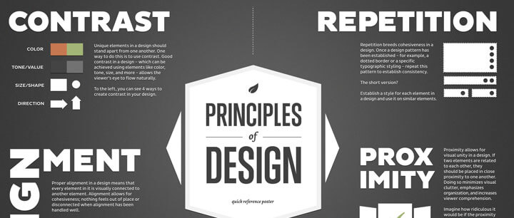
Have you heard the popular expression, “Go big or go home”? That describes how you want to use contrast! If there isn’t enough contrast between two elements on a page,it will look like a mistake.
Think about putting a hot pink shirt with red jeans. It’s not a combination most people would go for! We would say the shirt and the jeans clash because the colors are too close. In summary, when you apply contrast, don’t just make something different, make it very different.
The greater the difference the greater the contrast and the more effective the layout. If there isn’t enough contrast between two elements on a page, it will look like a mistake.
The principle of emphasis states that the most important element on the page should be the most prominent, the second most important element should be second to the most prominent and so on. Again, it is my opinion that contrast and emphasis go hand-in-hand because contrast is the way you create emphasis.
If you need to direct your audience’s attention to something specific in your layout, or emphasize it, you can direct their attention with contrast. Remember, go big or go home when using scale to create emphasis. You don’t want it to look like you made a mistake!
Related to emphasis is focal point. Establishing a focal point in your layout acts as a grounding point for viewers. Every design should have a focal point of some kind whether it be an image or typography.
Related to emphasis and contrast, proportion is the scale of elements in relation to one another. As a general rule, proportion has a strong effect on the dominance of elements, with larger elements having a stronger visual impact than smaller ones.
I liked this analogy I read on About.com. Imagine having to walk a long way with a 2 pound bag of rocks in one hand and a 10 pound bag of rocks in the other. After awhile, you would probably find yourself moving a few rocks from one bag to the other to balance your load and make it easier to walk.
Balance refers to the way elements are distributed throughout a design. If one section of your design is loaded down with a lot of components making it “heavier” than another, it makes the viewer uncomfortable.
There are three basic types of balance: symmetrical, asymmetrical, and radial. Symmetrical balance occurs when two sides of a design are the same. Asymmetrical balance is when the two sides of a design aren’t the same, but have elements that compliment one another and still provide the same kind of stability a symmetrical design provides.
Asymmetrical designs are generally more visually interesting than symmetrical ones. And finally, radial balance occurs when design elements are laid out in a circular pattern.
On my senior class trip we decided to see if we could fit my entire class of 27 people on an elevator. Let’s just say it was a bit tight. There was no room to move or breath! And it wasn’t comfortable. White space can be compared to “breathing room” for your layout. Just like trying to put 27 people in an average size elevator, designs that try to cram too much text and graphics onto the page are uncomfortable and make information difficult to read.
It is through white space that the content of any material gains more visibility and easy readability.
Balance between the amount of visual elements and the white space around it is important. Leaving too much white space, particularly in combination with a large font, can make your document look childish and makes you look amateur.
When I was in school, something I noticed among novice graphic designers was that many of them tended to put objects and/or text too close to the edge of the document. I also found this to be a problem while working at the print shop, especially with business cards.
Remember to leave at least 0.125 (⅛) inch on all sides of a business card. (At least!). If you are designing a postcard, I would say leave at least 0.25 (¼) inch.
And by the time you get to an 8.5 x 11 ̋ document, I would say you should leave at least 0.5 (½) inch on each side. As a general rule, the larger your printed document, the more space you want to leave around the edges of your layout.
Speaking of margins, don’t let Microsoft Word (or any other program) talk you into the default margins. Word automatically sets your margins at 1 ̋ and 1.5 ̋. Unless you are typing a term paper, you can probably go with something a little smaller. You be the judge.
The Z-layout is a great tool for any design project simply because it follows natural eye movement. (Remember, you don’t want your viewer working hard to figure out your message!).
The premise is simple: super-impose the letter Z on the page and the eye will naturally follow the path. It works like this: capture your viewers’ attention by placing the item you want the reader to see first in the upper left (think about where headlines are placed in newspapers and advertisements).
The viewer’s eye then travels toward the right, down the page diagonally to the lower left hand corner. The viewer reads the last line of the page and ends in the lower right corner. The z-pattern is complete.
Studies show that the z-layout works because most Western readers scan a layout the same way that they read a book – top to bottom, left to right. A good way to test the z-layout is to stand about eight or ten feet away, squint your eyes and see if you can make out the Z.
While the Z-layout isn’t going to be the perfect solution for every project, it’s certainly a layout that’s effective enough to warrant inclusion in any designer’s toolbox.