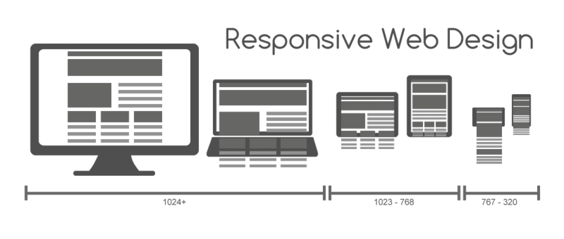
So what does a CSS media query look like and more importantly, how does it work? Enter the following code at the bottom of any CSS file and preview the related web page. Alternatively, you can open :
body {
background-color: grey;
}@media screen and (min-width: 320px) {
body {
background-color: green;
}
}
@media screen and (min-width: 550px) {
body {
background-color: yellow;
}
}
@media screen and (min-width: 768px) {
body {
background-color: orange;
}
}
@media screen and (min-width: 960px) {
body {
background-color: red;
}
}
Now, preview the file in a browser and resize the window. The background color of the page will vary depending upon the current viewport size. We’ll cover how the syntax works in more detail shortly. First, it’s important to know how and where you can use media queries.
Those that have been working with CSS since version 2 will know it’s possible to specify the type of device (for example, screen or print) applicable to a style sheet with the media attribute of the tag. Consider this example (which you’d place in the tags of your markup):
<link rel=”style sheet” type=”text/css” media=”screen” href=”screen-styles.css”>
Media queries add the ability to target styles based upon the capability or features of a device, rather than merely the type of device. Think of it as a question to the browser. If the browser’s answer is “true”, the enclosed styles are applied. If the answer is “false”, they are not.
Rather than just asking the browser “Are you a screen?”—as much as we could effectively ask with just CSS2—media queries ask a little more. Instead, a media query might ask, “Are you a screen and are you in portrait orientation?” Let’s look at that as an example:
<link rel=”stylesheet” media=”screen and (orientation: portrait)” href=”portrait-screen.css” />
First, the media query expression asks the type (are you a screen?), and then the feature (is your screen in portrait orientation?). The portrait-screen.css style sheet will be applied for any screen device with a portrait screen orientation and ignored for any others. It’s possible to reverse the logic of any media query expression by adding not to the beginning of the media query.
For example, the following code would negate the result in our prior example, applying the file for anything that wasn’t a screen with a portrait orientation:
<link rel=”stylesheet” media=”not screen and (orientation: portrait)” href=”portrait-screen.css” />
Combining media queries
It’s also possible to string multiple expressions together. For example, let’s extend one of our prior examples and also limit the file to devices that have a viewport greater than 800 pixels.
<link rel=”stylesheet” media=”screen and (orientation: portrait) and (min-width: 800px)” href=”800wide-portrait-screen.css” />
Further still, we could have a list of media queries. If any of the listed queries are true, the file will be applied. If none are true, it won’t. Here is an example:
<link rel=”stylesheet” media=”screen and (orientation: portrait) and (min-width: 800px), projection” href=”800wide-portrait-screen.css” />
There are two points to note here. Firstly, a comma separates each media query. Secondly, you’ll notice that after projection, there is no trailing and/or feature/value combination in parentheses. That’s because in the absence of these values, the media query is applied to all media types. In our example, the styles will apply to all projectors.
We can also use the @import feature of CSS to conditionally load style sheets into our existing style sheet. For example, the following code would import the style sheet called phone.css, providing the device was screen based and had a maximum viewport of 360 pixels:
@import url(“phone.css”) screen and (max-width:360px);
Remember that using the @import feature of CSS, adds to HTTP requests (which impacts load speed) so use this method sparingly.
Media queries in CSS
So far, we have included them as links to CSS files that we would place within thesection of our HTML and as @import statements. However, it’s more likely we will want to use media queries within CSS style sheets themselves. For example, if we add the following code into a style sheet, it will make all h1 elements green, providing the device has a screen width of 400 pixels or less:
@media screen and (max-device-width: 400px) { h1 { color: green }}
First we specify we want a media query with the @media at-rule, then we specify the type we want to match. In the preceding example, we want to apply the rules enclosed only to screens (and not, for example, print). Then, inside parenthesis we enter the specifics of the query.
“A shorthand syntax is offered for media queries that apply to all media types; the keyword ‘all’ can be left out (along with the trailing ‘and’). I.e. if the media type is not explicitly given it is ‘all’.”
Therefore, unless you want to target styles to particular media types, just leave the screen and part out. That’s the way we will be writing media queries in the example files from this point on.


