 Dan Knight
This blog will look in detail at media queries, hopefully providing all that’s needed to fully understand their capability, syntax, and future development.
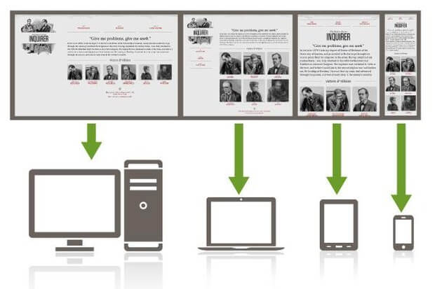
The CSS3 specification is made up of a number of modules. Media Queries (Level 3) are just one of these modules. Media queries allow us to target specific CSS styles depending upon the capabilities of a device. For example, with just a few lines of CSS we can change the way content is displayed, dependent upon things such as viewport width, screen aspect ratio, orientation (landscape or portrait), and so on.
Media queries are widely implemented. Pretty much everything other than ancient versions of Internet Explorer (8 and below) support them. In short, there’s absolutely no good reason not to be using them!
Specifications at the W3C go through a ratification process.If you have a spare day, knock yourself out with the official explanation of the process at http://www.w3.org/2005/10/Process-20051014/tr. The simpler version is that specifications go from Working Draft (WD), to Candidate Recommendation (CR), to Proposed Recommendation (PR) before finally arriving, many years later, at W3C recommendation (REC).
Modules at a greater maturity level than others are generally safer to use. For example, CSS Transforms Module Level 3 (http://www.w3.org/TR/css3-3d-transforms/) has been at WD status since March 2009 and browser support for it is far poorer than CR modules such as media queries.
CSS3 media queries enable us to target particular CSS styles to particular device capabilities or situations. If you head over to the W3C specification of the CSS3 media query module (http://www.w3.org/TR/css3-mediaqueries/), you’ll see that this is their official introduction to what media queries are all about:
“A media query consists of a media type and zero or more expressions that check for the conditions of particular media features. Among the media features that can be used in media queries are ‘width’, ‘height’, and ‘color’. By using media queries, presentations can be tailored to a specific range of output devices without changing the content itself.”
Without media queries we would be unable to substantially alter the visuals of a website using CSS alone. They facilitate us writing defensive CSS rules that pre-empt such eventualities as portrait screen orientation, small or large viewport dimensions, and more.
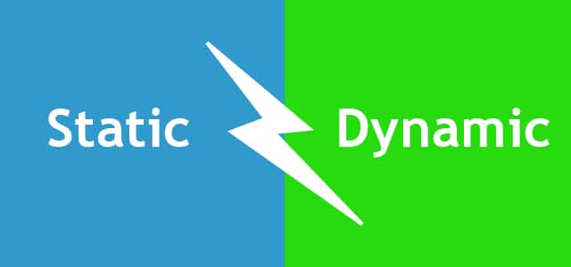
Whilst a fluid layout can carry a design a substantial distance, given the gamut of screen sizes we hope to cover, there are times when we need to revise the layout more fully. Media queries make this possible. Think of them as basic conditional logic for CSS.
Basic conditional logic in CSS
True programming languages all have some facility in which one of two or more possible situations are catered for. This usually takes the form of conditional logic, typified by an if/else statement.
If programming vernacular makes your eyes itch, fear not; it’s a very simple concept. You probably dictate conditional logic every time you ask a friend to order for you when visiting a cafe, “If they’ve got triple chocolate muffins I’ll have one of those, if not, I’ll have a slice of carrot cake”. It’s a simple conditional statement with two possible (and equally fine, in this case) results.
At the time of writing, CSS does not facilitate true conditional logic or programmatic features. Loops, functions, iteration, and complex math are still firmly in the domain of CSS processors (did I mention a fine book on the subject of the Sass pre-processor, called Sass and Compass for Designers?).
However, media queries are one mechanism in CSS that allows us to author basic conditional logic. By using a media query the styles within are scoped depending upon whether certain conditions are met.
Programming features on their way
The popularity of CSS pre-processors has made the people working on CSS specifications take note. Right now there is a WD specification for CSS variables: http://www.w3.org/TR/css-variables/
However, browser support is currently limited to Firefox so it’s really not something to consider using in the wild at present. In a future article we will show you how to make the fine media query syntax, media query in link tags, and also, how to combine media queries.

 Dan Knight