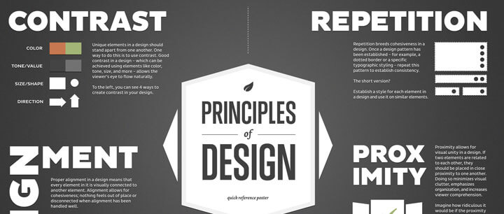
It’s natural to organize related information or objects into groups, right? We do it all the time. The principle of proximity tells us that related items should be grouped together and items that are not related should not be placed near each other in our graphic layouts as well.
When the elements of a design are scattered all over, the page appears unorganized and the reader has to take extra time and effort to make sense of your message. When those same objects are given close proximity, unity occurs and they become one visual unit rather than several separate units.
The principle of proximity helps organize information, reduces clutter, and gives the reader a clear structure. Notice the example below

The principle of repetition tells us that repeating design elements such as color, shapes and typefaces help establish a cohesive design by creating a clear sense of consistency.
Repeating elements within a design helps the viewer to navigate your layout with ease.
Repetition is also about using elements to make sure the design is viewed as being part of a larger whole. For example, even if you were to see this page separate from the rest of this book, you would know what book it belonged to because of the repeated use of elements such as yellow headers at the beginning of each general topic, blue headings that indicate more specific topics, and the fonts used for headlines and body copy.
In her book Basics of Design: Layout and Typography for Beginners, Lisa Grahm defines the principle of contrast as two or more visual elements on a page that look dramatically different from one another. Contrast is what we notice, and is what gives a design energy.
If none of the elements in your design are clearly dominant, it is difficult for the viewer to know where to begin. Layouts with strong contrast attract interest and help provide clarity while designs with weak contrast are boring and can be confusing.
In my opinion, contrast and emphasis go hand in hand because contrast is the way you create emphasis. If you need to direct your audience’s attention to something specific in your layout you can direct their attention with contrast. Juxtaposing radically different aesthetics can stimulate interest at a glance.
Below are a few ways you can use contrast in your designs
- Black versus white
- Small versus Large
- A script font with a regular font
- A grayscale design with a pop of color
Want to take your design to the next level with even more contrast?
Combine two or more of these elements!

Contrast with Type
We use contrast with type all the time. Anytime you’ve bolded a word, you have applied the principle of contrast, but our goal is to take it to the next level.
In general, the first rule when combining fonts is to choose two that are different classifications. Combine a serif and a sans-serif, or a serif and a script, etc., and you’ll be on your way. You can start by experimenting with combinations of regular and italic fonts.
MinionProBold MinionProItalic
Something you probably haven’t thought about is the different weights of fonts themselves. Combining typefaces of two different weights is an easy way to create typographic contrast. Look at the difference between the weight of two fonts like Impact and Century Gothic. I didn’t even increase the point size of “think big” and it stands out.

Just think what happens when we combine different font weights with scale! Scale refers to the size of one font in relation to another. In the sample below, the smaller type is 14 point Century Gothic and the “think big” is 27 point Impact. Getting better isn’t it?

Contrast with Color
The next step in creating contrast in our sample below is to add color to emphasize “think big.” Notice that I not only made “think big” red, but I also made the black type gray.