On a most basic level, layout in graphic design refers to the arrangement of visual elements on a page.
Page layout, or page composition, is the process of placing and arranging and rearranging text and graphics on a page. A good composition is one that is not only pleasing to look at but also effectively conveys the message of the text and graphics to the intended audience.
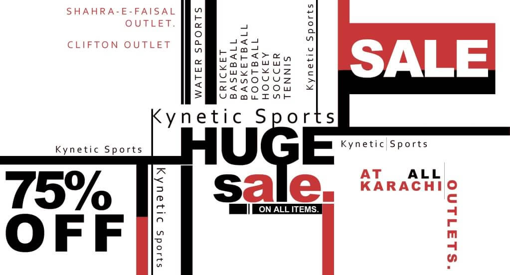
“Right and wrong do not exist in graphic design. There is only effective and non-effective communication.” Peter Bilak, Illegibility
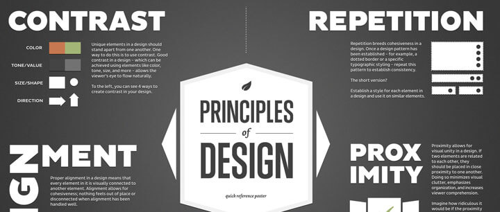
Design principles describe fundamental ideas about the practice of good visual design, or layout. These principles are guidelines to help you make the most effective and attractive layout.
Alignment
Alignment refers to the invisible line connecting graphic elements or objects on a page. Our brains crave a certain amount of order and consistency, and aligning the graphic elements, as well as the text elements, on your page definitely helps to accomplish this.
Today, most people are familiar with the term alignment. You know that you can center, right or left align text, however, alignment doesn’t end there! There are rules regarding the use of alignment pertaining to text and objects. How you align type and graphics on a page, and in relation to each other, can make your layout easier to read, and bring excitement to a stale design.
It can also be the difference between a professional looking design and an amateur looking design.
Center Text Alignment
An easy way to make your designs look more sophisticated is to avoid centered text. While centered text has its place, it is often the mark of a novice. Center text alignment creates a formal feel and should be reserved for things like wedding invitations, greeting cards,certificates and other formal documents.
Centered Text
-Lends a formal appearance to text
-It is generally harder to read because the starting position of each line changes
-Works best with short lines (and some extra space between lines of text)
-As a general rule, avoid centering headlines too In the samples below, which alignment looks the most sophisticated? The least?
As with any other aspect of layout, alignment depends on the purpose of your design, your audience and its expectations, and any other elements on the page. Use the alignment that makes the most sense for your particular design and that effectively communicates your message.
Note: right alignment generally works best for small bits of text, such as posters, postcards, and business cards. Also be aware that sometimes you may need to use visual, or optical, alignment to fix some of the problems that can occur due to the varying shapes of letters and graphics. In visual alignment, objects may not be precisely aligned according to your computer, but to the eye they appear aligned. Is it ever okay to break alignment? Yes, as long as it serves a specific purpose such as drawing attention to a specific element on the page.
One more thing concerning alignment! Choose one alignment and stick with it. I’ve seen too many resumes where the person centered their headings and then left aligned everything else. Choosing one alignment will ensure a more polished looking layout.
Object Alignment
Edge alignment is when shapes or elements are aligned based on their straight edges and is most commonly seen among simple geometric shapes like rectangles or triangles. As with text alignment, objects can be centered, right or left aligned.
Text & Objects Aligned Together
When you combine text and objects, it is especially important to align them with each other. Notice in this book how I have left aligned all of the graphic elements with the left aligned body copy. Most people would left align the body copy and then center the images. Aligning the graphic elements with the text gives the layout a more sophisticated look.