Learn the art of font pairing with our Typography 101 guide. Discover how to choose fonts that work together, avoid common mistakes, and create designs that captivate.
In this guide, we’ll explore the fundamentals of font pairing, why it matters, and how to combine typefaces that create harmony, balance, and impact.
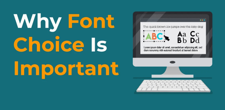
Why Typography Matters in Design
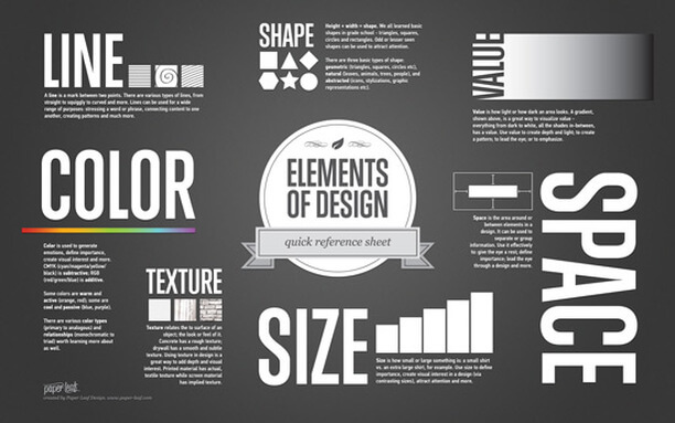
Typography is more than decoration. Fonts communicate mood, authority, and brand identity before the words are even read. A luxury brand with an elegant serif font feels entirely different from a bold sans-serif promoting a tech startup.
Great typography ensures:
- Readability – Easy for the audience to consume.
- Consistency – Creates a visual identity across platforms.
- Emotion – Fonts evoke feelings that align with a brand’s message.
- Hierarchy – Guides readers through content in a logical flow.
When fonts clash, the result looks messy, unprofessional, and confusing. When they harmonise, they deliver clarity and confidence.
The Foundations of Font Pairing
Before diving into which fonts work together, let’s cover the core principles of pairing typefaces:
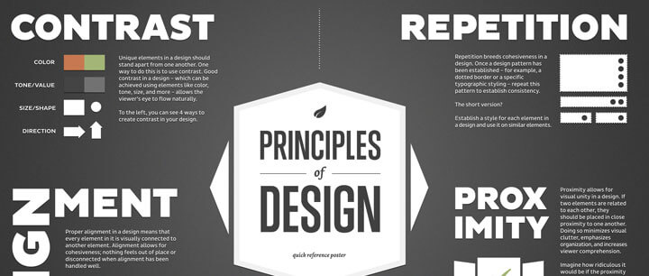
- Contrast is Key
Pairing fonts that are too similar looks accidental. Instead, go for contrast – like a serif headline with a sans-serif body. - Stick to Two or Three Fonts
Too many typefaces cause chaos. A headline, subheading, and body font is usually enough. - Establish Hierarchy
Use fonts strategically to guide attention: headlines bold, body text clean, call-to-action striking. - Consider Context
The font choice must reflect the message. A playful script may work for an event invitation but not for a financial report.
Popular Font Pairing Techniques
Here are a few tried-and-tested strategies to create professional typography combinations:
1. Serif + Sans-Serif
Classic and versatile. Serif fonts add tradition and elegance, while sans-serifs bring modern simplicity. Together, they balance old and new.
Example: Playfair Display (serif) + Open Sans (sans-serif)
2. Font Families
Choose different weights and styles within the same family for effortless cohesion.
Example: Roboto Regular + Roboto Bold
3. Display + Neutral
Use a decorative display font for headlines paired with a neutral sans-serif for body text. This keeps the design engaging but readable.
Example: Lobster (display) + Lato (sans-serif)
Common Mistakes to Avoid
- Overusing Decorative Fonts – They should be accents, not the main meal.
- Ignoring Spacing – Kerning and line height are just as important as font choice.
- Random Pairings – Choosing fonts without intention leads to inconsistency.
Real-World Application of Font Pairing
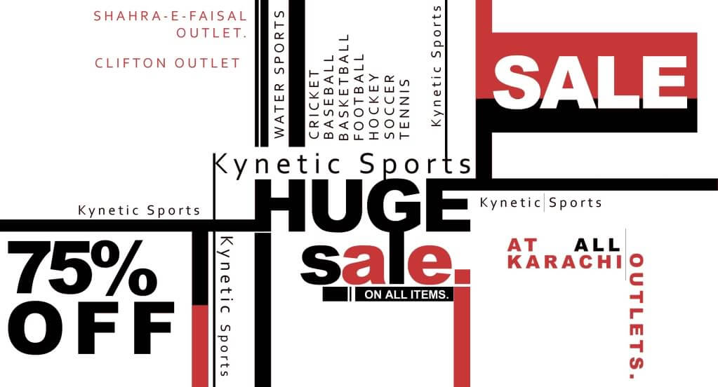
Typography isn’t confined to books and websites – it shapes every interaction we have with brands. From packaging to mobile apps, the way fonts are paired changes how people perceive a product or service.
For example, in entertainment and digital platforms, typography plays a role in making websites more engaging. Even something as dynamic as casino games relies on strong font pairing to create excitement while ensuring users can navigate seamlessly. Typography here isn’t just about style; it’s about functionality, guiding players through menus, bonus offers, and game titles effortlessly.
Tools to Help You Choose Fonts
You don’t have to start from scratch every time. Designers have access to amazing tools that simplify font pairing:
- Google Fonts Pairings – Free and widely used combinations.
- FontPair.co – Suggests professional pairings for different use cases.
- Typewolf – Curated inspiration from real-world websites.
- Canva Font Combinations – Beginner-friendly, quick suggestions.
Final Thoughts
Typography is one of the most powerful weapons in a designer’s arsenal. Choosing fonts that work together is about balancing contrast and cohesion while reflecting the personality of the brand. By following the principles outlined here, you can elevate your designs, make them more professional, and ensure they communicate exactly what you intend.
Remember: fonts aren’t just words. They’re voice, tone, and identity. Mastering how to pair them effectively will set you apart as a designer who understands not just visuals but storytelling.